チャートの選び方
よく言われる注意点
円グラフは極力使わず、比率は帯グラフで表す(円は各カテゴリの大小がわかりにくい)
A friendly guide to choosing a chart type | Datawrapper Blog
pandasのTIPS
pandasでformat
import pandas as pd
import numpy as np

# サンプルデータ
np.random.seed(0)
df = pd.DataFrame({"A": np.random.poisson(lam=10, size=5), "B": np.random.randn(5)})小数点の丸め込み
df.style.format(precision=3, thousands=",", decimal=".")Loading...
# 列ごとに指定したい場合
df.style.format({"A": "{:.1f}", "B": "{:.1%}"})
Loading...
info - Unknown Directive
info - Unknown Directivestyle.formatは追加のパッケージが必要になる。 pandasのみで使えるのは .apply() と 標準の文字整形メソッド `str.format` を使うもの
df["B"].apply("{:.1%}".format)0 14.4%
1 145.4%
2 76.1%
3 12.2%
4 44.4%
Name: B, dtype: object# dictに指定しなかった列は含まれないので注意
df.apply({"A": "{:.1f}".format, "B": "{:.1%}".format})Loading...
値の大きさに応じた色を塗る
import seaborn as sns
cm = sns.light_palette("green", as_cmap=True)

df.style.background_gradient(cmap=cm)棒グラフを作る
df.style.bar(subset=["A", "B"], color='#d65f5f')Loading...
Source
from great_tables import GT, html
from great_tables.data import airquality
airquality_m = airquality.head(5).assign(Year=1973)
gt_airquality = (
GT(airquality_m)
.tab_header(
title="New York Air Quality Measurements",
subtitle="Daily measurements in New York City (May 1-10, 1973)",
)
.tab_spanner(label="Time", columns=["Year", "Month", "Day"])
.tab_spanner(label="Measurement", columns=["Ozone", "Solar_R", "Wind", "Temp"])
.cols_move_to_start(columns=["Year", "Month", "Day"])
.cols_label(
Ozone=html("Ozone,<br>ppbV"),
Solar_R=html("Solar R.,<br>cal/m<sup>2</sup>"),
Wind=html("Wind,<br>mph"),
Temp=html("Temp,<br>°F"),
)
)
gt_airqualityLoading...
matplotlibのTIPS
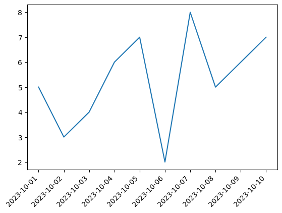
autofmt_xdate():日付ラベルを整える
日付ラベルが重なりそうなら傾きをつけてくれる
matplotlib.figure.Figure.autofmt_xdate — Matplotlib 3.9.2 documentation
import matplotlib.pyplot as plt
import pandas as pd

dates = pd.date_range('2023-10-01', periods=10, freq='D')
values = [5, 3, 4, 6, 7, 2, 8, 5, 6, 7]

fig, ax = plt.subplots()
ax.plot(dates, values)
fig.autofmt_xdate(rotation=45, ha='right')
plt.show()