Regression
二乗誤差
誤差を二乗するので、絶対誤差に比べて大きく予測を外した値が強調されるのが特徴。
MSE (Mean Squared Error)
二乗誤差 を平均したもの
RMSE (Root Mean Squared Error)
MSEの平方根。元の単位に戻るため比較的解釈しやすい。
絶対誤差
二乗しないため外れ値に強い。
また、ビジネスサイドへの説明も行いやすい。(RMSEは「誤差を二乗して平方根をとったもので⋯」とか説明しても計算が複雑でわかりにくい)
MAE (Mean Absolute Error)
平均絶対誤差。誤差の絶対値の平均。
絶対誤差の勾配は符号しか残らない
Source
import matplotlib.pyplot as plt
import numpy as np

e = np.linspace(-2, 2, 100)

plt.figure(figsize=[4,3])
plt.plot(x, e**2, label=r"Squared Error $e^2$")
plt.plot(x, abs(e), label=r"Absolute Error $|e|$")

plt.ylabel(r"$error$")
plt.xlabel(r"$e$")
plt.legend()
plt.show()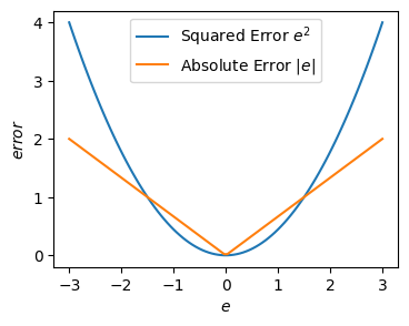
MAPEに近いのはMAEではなくFair Loss。
MAE、つまり絶対誤差だと勾配をとったときに残差の符号しか残らず、誤差の大きさがわからなくなる。
その点、Fair Lossのほうがいい
(参考:SIGNATE 土地価格コンペ 1位解法)
RMSEとMAE
どっちがいいか?という議論があるらしい
確率予測
Source
# データ生成
from sklearn.datasets import make_classification
size = 1000
args = dict(n_samples=size, n_features=2, n_informative=1, n_redundant=1, class_sep=0.5, n_classes=2, n_clusters_per_class=1, random_state=0)
X_train, y_train = make_classification(**args)
X_test, y_test = make_classification(**args)

# 予測確率の例
from sklearn.linear_model import LogisticRegression
clf = LogisticRegression()
clf.fit(X_train, y_train)
y_prob = clf.predict_proba(X_test)[:, 1]
Calibration Plot
横軸に予測確率
縦軸には経験確率、つまり「同じくらいの予測確率になったサンプルを集めたときの実際の正例の比率」
を出したプロット
(参考:1.16. Probability calibration — scikit-learn 1.7.2 documentation)
Source
import numpy as np
import matplotlib.pyplot as plt
from sklearn.calibration import CalibrationDisplay

# キャリブレーションプロット
disp = CalibrationDisplay.from_predictions(
    y_true=y_test,
    y_prob=y_prob,
    n_bins=10,          # 分割数(デフォルト10)
    strategy="uniform", # ビンの区切り方(uniform または quantile)
    name="Logistic Regression"
)

plt.title("Calibration Plot (Reliability Curve)")
plt.grid(True)
plt.show()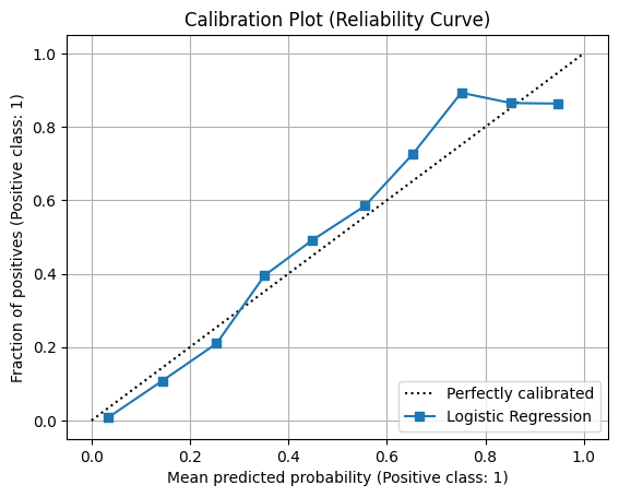
from sklearn.metrics import log_loss
log_loss(y_test, y_prob)0.3873822188513259Brier Score Loss
Brier Score は 正解クラスと予測確率の平均二乗誤差(MSE)で定義される指標。低いほど良いのでBrier Score Lossとも呼ばれる。
2クラス分類の場合
2クラス分類の場合は正解クラスと予測確率により次のように表され、の値をとる。
クラス分類の場合
一般にクラス分類の場合は次のように表され、の値をとる。
from sklearn.metrics import brier_score_loss
brier_score_loss(y_test, y_prob)0.1209847403686766混同行列(Confusion Matrix)
True Positive (TP) と True Negative (TN) に分けられた数の分布を視覚的に判断する
| 実際\予測 | Positive | Negative |
|---|---|---|
| Positive | TP(真陽性) | FN(偽陰性) |
| Negative | FP(偽陽性) | TN(真陰性) |
Source
# create sample data
import numpy as np
size = 100
np.random.seed(42)
y_true = np.random.binomial(n=1, p=0.2, size=size)
y_pred = np.random.binomial(n=1, p=0.2, size=size)

# confusion matrix
import matplotlib.pyplot as plt
fig, ax = plt.subplots(figsize=[4, 3])
from sklearn.metrics import ConfusionMatrixDisplay
ConfusionMatrixDisplay.from_predictions(y_true, y_pred, ax=ax)
<sklearn.metrics._plot.confusion_matrix.ConfusionMatrixDisplay at 0x7a1796589720>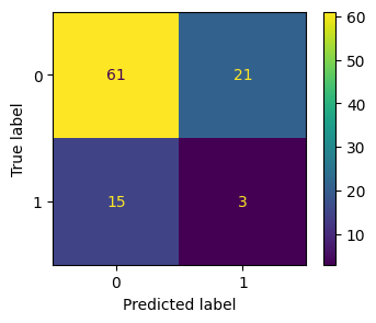
Accuracy(正解率)
全体のうち、正しく分類できた割合。
Recall(再現率)
実際に「正例(Positive)」であるもののうち、正しく予測できた割合。
どれだけFalse Negativeを小さくできたか。
Precision(適合率)
「正例(Positive)」と予測したうち、実際にPositiveだった割合。
どれだけFalse Positiveを小さくできたか
F1-score
PrecisionとRecallの調和平均。両者のバランスを取る指標。
PrecisionとRecallにはトレードオフ関係がある(https://
from sklearn.metrics import accuracy_score, recall_score, precision_score, f1_score
for metrics in "accuracy_score, recall_score, precision_score, f1_score".split(", "):
    value = eval(f"{metrics}(y_true, y_pred)")
    print(f"{metrics}={value:.2}")
accuracy_score=0.64
recall_score=0.17
precision_score=0.12
f1_score=0.14
複数の閾値のもとでの指標
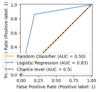
ROC-AUC(Area Under the ROC Curve)
ROC曲線(真陽性率 vs 偽陽性率)の下の面積。
1に近いほどモデルの識別能力が高い。
true positive rate (recallの別名、陽性者を正しく陽性だと当てる率、sensitivityとも)とfalse positive rate (陰性者のうち偽陽性になる率)
を用いて閾値を変えながら描いた曲線をreceiver operating characteristic(ROC; 受信者操作特性)曲線という。
ROC曲線の下側の面積(Area Under the Curve)をROC-AUCという。ランダムなアルゴリズム(chance level)だとROC-AUCは0.5になる
Source
from sklearn.datasets import make_classification
size = 1000
X, y = make_classification(n_samples=size, n_features=2, n_informative=1, n_redundant=1,
                           class_sep=0.5, n_classes=2, n_clusters_per_class=1, random_state=0)

# ランダムなアルゴリズム
import numpy as np
np.random.seed(1)
random = np.random.binomial(n=1, p=0.5, size=size)

# Logistic Regression
from sklearn.linear_model import LogisticRegression
clf = LogisticRegression()
clf.fit(X, y)
y_pred = clf.predict(X)

# plot
import matplotlib.pyplot as plt
fig, ax = plt.subplots(figsize=[4, 3])

from sklearn.metrics import RocCurveDisplay
RocCurveDisplay.from_predictions(
    y,
    random,
    name="Random Classifier",
    color="darkorange",
    ax=ax
)
RocCurveDisplay.from_predictions(
    y,
    y_pred,
    name="Logistic Regression",
    color="steelblue",
    plot_chance_level=True,
    ax=ax
)
fig.show()
/tmp/ipykernel_57789/1909585709.py:37: UserWarning: Matplotlib is currently using module://matplotlib_inline.backend_inline, which is a non-GUI backend, so cannot show the figure.
fig.show()
Precision-Recall Curve
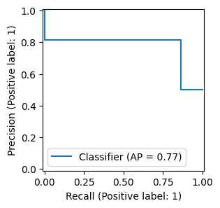
さまざまなthresholdの元でのRecallとPrecisionを算出し、横軸にRecall、縦軸にPrecisionを結んだグラフ
PR曲線の下側の面積(Area Under the Curve)をPR-AUCあるいはAverage Precisionという
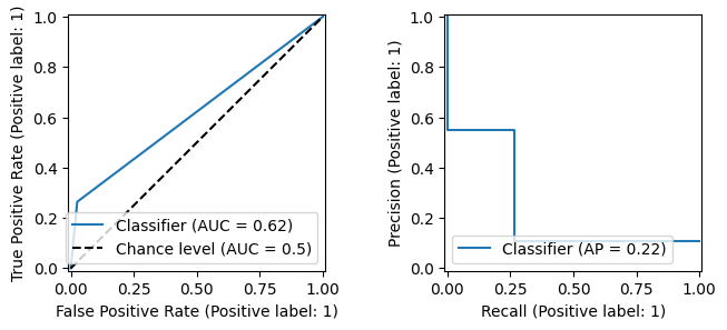
ROC曲線とは異なり、「ランダムなアルゴリズムなら0.5」のような安定したスケールではなく、スケールはクラスのバランス(不均衡具合)に依存する
その分、不均衡データにおけるモデル評価に向いていると言われている
Source
from sklearn.datasets import make_classification
size = 1000
X, y = make_classification(n_samples=size, n_features=2, n_informative=1, n_redundant=1,
                           class_sep=0.5, n_classes=2, n_clusters_per_class=1, random_state=0)

# Logistic Regression
from sklearn.linear_model import LogisticRegression
clf = LogisticRegression()
clf.fit(X, y)
y_pred = clf.predict(X)

# plot
import matplotlib.pyplot as plt
fig, ax = plt.subplots(figsize=[4, 3])

from sklearn.metrics import PrecisionRecallDisplay
PrecisionRecallDisplay.from_predictions(y, y_pred, ax=ax)
fig.show()
/tmp/ipykernel_57789/2352438180.py:18: UserWarning: Matplotlib is currently using module://matplotlib_inline.backend_inline, which is a non-GUI backend, so cannot show the figure.
fig.show()
imbalanced dataとPR曲線・ROC曲線
ある不均衡データがあったとする
from sklearn.datasets import make_classification
size = 1000
X, y = make_classification(n_samples=size, n_features=2, n_informative=1, n_redundant=1, weights=[0.9, 0.1],
                           class_sep=0.5, n_classes=2, n_clusters_per_class=1, random_state=0)

import pandas as pd
pd.Series(y).value_counts()
0 894
1 106
Name: count, dtype: int64Source
# Logistic Regression
from sklearn.linear_model import LogisticRegression
clf = LogisticRegression()
clf.fit(X, y)
y_pred = clf.predict(X)

from sklearn.metrics import accuracy_score, recall_score, precision_score, f1_score
for metrics in "accuracy_score, recall_score, precision_score, f1_score".split(", "):
    value = eval(f"{metrics}(y, y_pred)")
    print(f"{metrics}={value:.2}")
accuracy_score=0.9
recall_score=0.26
precision_score=0.55
f1_score=0.36
Source
import matplotlib.pyplot as plt
fig, ax = plt.subplots(figsize=[4, 3])
from sklearn.metrics import ConfusionMatrixDisplay
ConfusionMatrixDisplay.from_predictions(y, y_pred, ax=ax)
<sklearn.metrics._plot.confusion_matrix.ConfusionMatrixDisplay at 0x7a179615d9c0>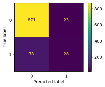
Source
# plot
import matplotlib.pyplot as plt
fig, axes = plt.subplots(figsize=[8, 3], ncols=2)

from sklearn.metrics import RocCurveDisplay, PrecisionRecallDisplay
RocCurveDisplay.from_predictions(y, y_pred, plot_chance_level=True, ax=axes[0])
PrecisionRecallDisplay.from_predictions(y, y_pred, ax=axes[1])
fig.show()
/tmp/ipykernel_57789/4277730166.py:8: UserWarning: Matplotlib is currently using module://matplotlib_inline.backend_inline, which is a non-GUI backend, so cannot show the figure.
fig.show()
マシューズ相関係数(MCC)
マシューズ相関係数(Matthews Correlation Coefficient: MCC) は二値分類モデルの性能評価指標の一つで、特にクラスの不均衡がある場合に信頼性が高いことで知られている。
言葉でいうと
分子: 正しく分類された数(TP × TN) から、 誤分類の積(FP × FN) を引いたもの。
分母:全体の規模を正規化(0除算を防ぐため)。
from sklearn.metrics import matthews_corrcoef

y_true = [1, 1, 0, 0, 0, 0, 0]
y_pred = [1, 0, 1, 0, 0, 0, 0]
print(f"MCC: {matthews_corrcoef(y_true, y_pred):.3f}")

# 不均衡なデータに対してMajority Classだけを予測した場合
y_true = [1, 0, 0, 0, 0, 0, 0]
y_pred = [0, 0, 0, 0, 0, 0, 0]
print(f"MCC: {matthews_corrcoef(y_true, y_pred):.3f}")
MCC: 0.300
MCC: 0.000
Balanced Accuracy
Balanced Accuracy は、各クラスの正解率(リコール、感度)を平均したもの
ここで:
:感度(Sensitivity)または再現率(Recall)
:特異度(Specificity)
不均衡データに強いとされる。
from sklearn.metrics import accuracy_score, balanced_accuracy_score

# 不均衡なデータに対してMajority Classだけを予測した場合
y_true = [1, 0, 0, 0, 0, 0, 0]
y_pred = [0, 0, 0, 0, 0, 0, 0]

print(f"accuracy: {accuracy_score(y_true, y_pred):.3f}")
print(f"balanced_accuracy: {balanced_accuracy_score(y_true, y_pred):.3f}")
accuracy: 0.857
balanced_accuracy: 0.500
多クラス分類(Multiclass Classification)
Macro F1
各クラスのF1スコアを単純平均したもの。クラス不均衡に弱い。
各クラスを等しく扱う。
Micro F1
全サンプルのTP・FP・FNを合計してからF1を計算。
サンプル数の多いクラスに影響されやすい。
Weighted F1
各クラスのF1をクラスのサンプル数で重み付けして平均。
クラス不均衡データに適する。
ランキング・推薦(Ranking / Recommender)
Precision@k
上位 件の予測のうち、正解が占める割合。
Recall@k
上位 件が、全正解のうちどれだけをカバーしたか。
MAP(Mean Average Precision)
各クエリに対する平均適合率(AP)を平均化したもの。
NDCG(Normalized Discounted Cumulative Gain)
順位の高い正解をより高く評価する。上位の重要性を考慮。
MRR(Mean Reciprocal Rank)
最初の正解が出現する順位の逆数を平均。
類似度
コサイン類似度
ベクトルの方向が似ているものは似ている
コサイン類似度(Cosine Similarity)とは?:AI・機械学習の用語辞典 - @IT
2つのベクトルがなす角(コサイン)の値が類似度として使える、ということになる
\renewcommand{\b} when command \b does not yet exist; use \newcommand

\renewcommand{\b}[1]{\boldsymbol{#1}}
\b{a} \cdot \b{b} = ||\b{a}|| \ ||\b{b}|| \cos(\b{a}, \b{b})
\\
\implies \cos(\b{a}, \b{b}) = \frac{ \b{a} \cdot \b{b} }{ ||\b{a}|| \ ||\b{b}|| }
Source
import numpy as np
import matplotlib.pyplot as plt

def cos(a, b):
    e = 1e-8
    return a @ b / (np.linalg.norm(a + e) * np.linalg.norm(b + e))

def plot(ax, a, b):
    for x in [a, b]:
        ax.axhline(color="gray", alpha=.5)
        ax.axvline(color="gray", alpha=.5)
        ax.text(x[0], x[1], f"{x[0], x[1]}", color="black")
        ax.annotate("", xy=(x[0], x[1]), xytext=(0, 0),
                    arrowprops=dict(arrowstyle="->", connectionstyle="arc3"))
        ax.set(title=f"cos(a, b) = {cos(a, b):.2f}", xlim=(-5, 5), ylim=(-5, 5))
        # ax.grid(True)
    return ax


data = [
    [
        np.array([4, 4]),
        np.array([2, 2])
    ],
    [
        np.array([1, 3]),
        np.array([4, 3])
    ],
    [
        np.array([4, 0]),
        np.array([0, 4])
    ],
    [
        np.array([3, 3]),
        np.array([-4, -4])
    ]
]

fig, axes = plt.subplots(figsize=(8, 2), ncols=4)
for i in range(4):
    a, b = data[i]
    plot(axes[i], a, b)
fig.tight_layout()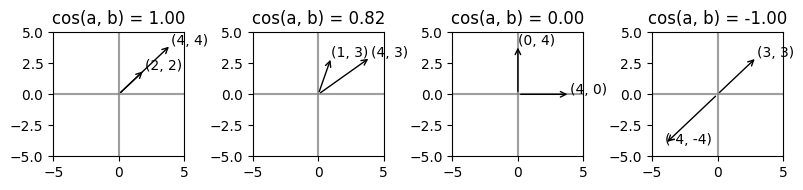
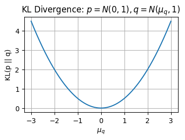
Source
import numpy as np
import matplotlib.pyplot as plt
from scipy.stats import norm

# Fix p = N(0,1)
mu_p = 0
sigma_p = 1

# q = N(mu_q, 1), vary mu_q
mu_q_vals = np.linspace(-3, 3, 200)
sigma_q = 1

# KL for normal distributions with same variance simplifies to:
# KL = (mu_p - mu_q)^2 / (2*sigma^2)
kl_vals = ((mu_p - mu_q_vals)**2) / (2 * sigma_q**2)

plt.figure(figsize=(4,2.5))
plt.plot(mu_q_vals, kl_vals)
plt.xlabel(r"$\mu_q$")
plt.ylabel("KL(p || q)")
plt.title(r"KL Divergence: $p = N(0,1), q = N(\mu_q,1)$")
plt.grid(True)
plt.show()